
Top 8 Modern App Design Tips For A Better UI/UX

Introduction:
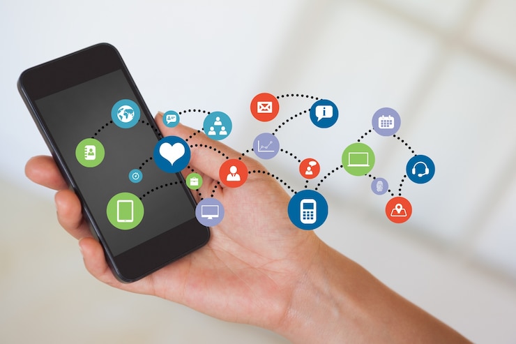
As we all know, UI & UX design is increasingly used in web and mobile application design. The two key considerations are the user experience, or UX, and the user interface, or UI. In addition to ongoing mobile and online UI design improvements, both UI and UX are made when you have a specific level of awareness or distinction in your current niche and typical general trends incorporated in your industry.
We have gathered expertly created, contemporary Mobile App UI Designs. Professional graphic designers and app development teams that can access the major platforms on the internet generate all of the UI/UX designs for mobile apps. There is a lengthy collection of modern applications UI/UX designs online.

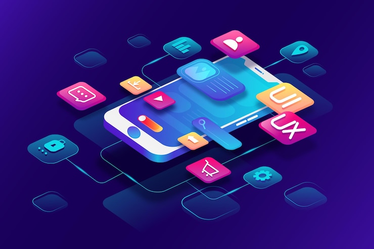
Modern App Screen UI/UX Design Ideas:
User Experience (UX) refers to all the components and aspects of a user's engagement with a certain environment or device that influence their feelings about the product, brand, or background. UX is a personal, user-centered concept.
A person's perceptions and reactions as a result of using or anticipating a product, system, or service are referred to as their user experience (UX) in the standard definition.

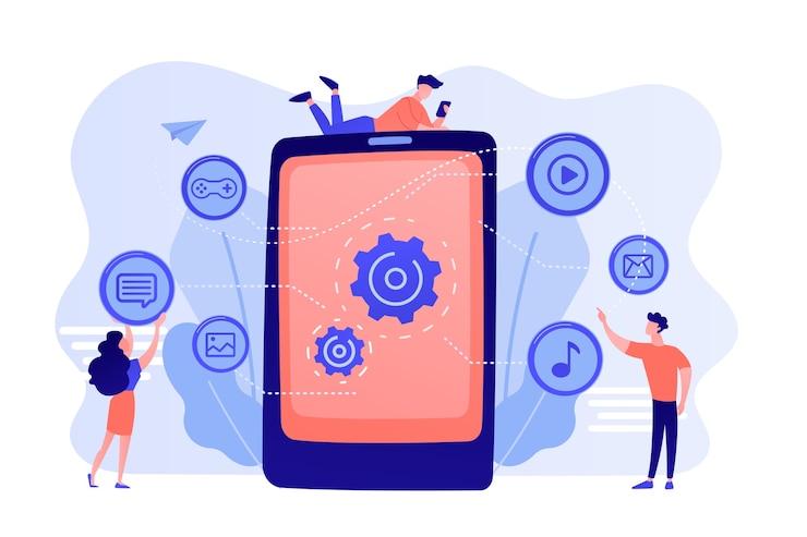
Tips for creating a modern app:
Keep direct actions visible:
Making your items usable by as many people as feasible is the practice of accessibility. To "design for everyone," it's crucial to consider the many ways users hold their mobile devices in actuality.
There are three major ways that individuals hold their phones in their hands. The intention is to incorporate these places into the design of the key actions.
Think about readability:
It can be difficult to put much information on a small mobile UI because mobile devices have smaller screens than desktops. Great UX is achieved by combining good readability with other design components.
Prevent the long-scroll issue:
Long scrolling is an excellent approach to maintaining readers' attention while reading lengthy passages. Studies reveal that the more we browse, the more we lose interest or become dissatisfied in other situations, such as when users are asked to complete a task.
By dividing jobs into login screen design or employing cards with a "tap to expand" capability, try to keep login screen design as brief as feasible.
Font size and type:
Different fonts can convey various feelings while also making text simple to read. Poor font selection can also ruin your design, which is why most designers first spend a lot of time selecting the ideal typefaces. Here are some crucial font-related pointers to bear in mind:
Typeface: To ensure readability and usability in all sizes, pick a typeface that performs well in various sizes and weights.
Font-Size: Make your font size readable. As advised by Apple and Google, users should use at least 11 points to read without zooming in.
The contrast in color: Use contrast checkers to avoid bright color conflicts between the font and backdrop. Use the 60-30-10 guideline, which specifies a good ratio for striking a balance between the hues.

Make sure there is enough space and padding:
You shouldn't automatically utilize smaller text or less space on a smaller screen. Avoid overlapping text or other elements. By increasing the line height or element spacing, we can improve legibility.
Also, bear in mind that new technologies are constantly being developed. Thus designers must stay current. For instance, increasing padding by a few pixels on a curved phone display is necessary to prevent accidental touches (16pt is the minimum suggested padding for devices).
Invent finger-friendly buttons:
Small touch controllers can induce accidental tapping. Create controls with a minimum size of 10–12 mm (40px), so they can be correctly tapped with a finger to eliminate this annoyance.
Think of any advertisements you may view when using a mobile device to help you grasp how crucial this advice is. Buttons on promotions are frequently tiny, difficult to see, and difficult to reach. Naturally, the goal of these CTAs is to avoid the unwanted unintentional touches that we all detest.
Ensure that the tab bars are tidy:
Every program has tab bars. Thus it would help if you took great care while creating them. Get inventive later; right now is not the time.
For a better mobile user experience, create neat and clear tab bars and, whenever possible, give each tab a name. Icons should only be used when you are 100 percent certain that users will recognize and comprehend their meaning. If we use icons, they should have the least amount of creative design elements feasible in their structure.

Use the accustomed navigation bars:
For your navigation menu, stick to common patterns like the iOS tab bar or Android nav drawer. Don't strive to create something new. Users will find your software more natural because they are accustomed to these frequent patterns. It also holds for other components on these platforms with various creative designs.
Space:
Give your spaces some breathing room. Margins, particularly the horizontal ones, line height, padding, and margins. I've discovered that designers naturally resist creating more space. Most of the time, the objective is to fill the user's viewport with as much content as possible.
It indicates a lot of room to expand more space vertically. Try a 12px margin if you think you need an 8px one. Start bigger and scale it back if you think it's too much.
Absent headers:
The 2010s are over for solid headers. Remove those solid-colored headers for your app to look more current instantly (different from the background color). Instead, headers might slide in as the user scrolls down the page to provide context or prompt rapid actions. It instantly incorporates the essential white space into your design, giving it a more airy and uncluttered appearance.

Show off those curves:
Evolutionarily, we have adapted to see rounded items as friendly or safe and pointy objects as harmful or aggressive. This difference benefited our struggle for survival. Even today, we still have that fundamental survival drive.
Stay away from sharp corners unless you want to come across as aggressive. Action games are a wonderful example of utilizing sharp edges.
Use pictures:
People are visual beings. Two types of images are used in UX design: pictures and illustrations. If you believe an example will help to explain a point, use it. Add a photo if you think it will assist and provide more context. Try to break up lengthy content scrolls with intervals of pertinent visuals.
Concepts for User-Friendly App Design:
Users now have an increasing number of alternatives for using modern applications for different personal and professional requirements, from useful calendars, trackers, and recipe apps to inventory dashboards, e-commerce, and financial management. Additionally, user experience designers consider novel strategies, fixes, and interactions to make mobile apps practical and simple.

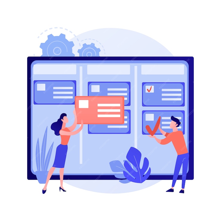
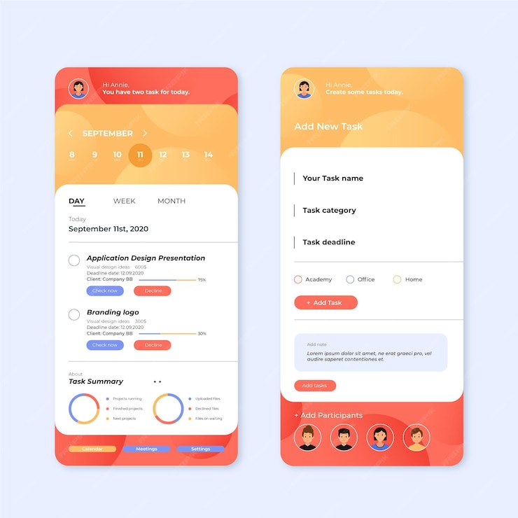
App for Task Manager:
As we try to discover the best method to arrange the many tasks in our lives in a tidy manner, task organizer applications become very helpful. Here's a quick look at one of their digital designs. Users can organize their work, set different calendars, and use a straightforward, aesthetically pleasing UI. While the dark theme promotes a good balance of contrast to make text and vivid color accents deep, scannable, and prevent eye strain in any usage setting, color marking makes it easier to monitor chores from several calendars.

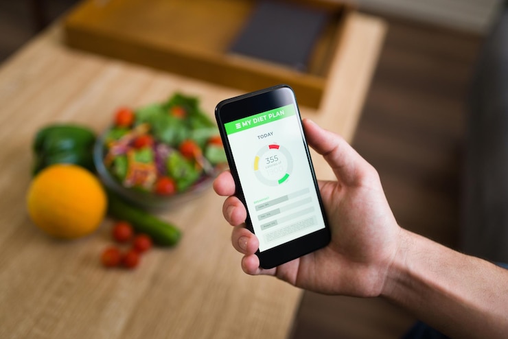
Calorie Counting App:
Those who are concerned about staying in shape are aware of how important eating well is. Several apps available today assist users in tracking their eating patterns and analyzing how they affect their weight and general well-being. Still, we would like to offer our perspective on the subject. So, this is the user interface created for the app that calculates calories and helps users comprehend the basic components of the food they eat. The app is user-friendly, beautiful, and engaging thanks to its light, airy interface, custom graphics, and fluid animation type. The warm app palette's primary hue is fresh green. However, data visualization, which enables users to feel confident in their statistics and progress, is what UX designers focus on the most.

Exotic Fruit Online Store:
This mobile user interface design project is brimming with vibrant colors and delicious aesthetics. Look at the product screens created for the mobile e-commerce application where you can purchase different exotic fruits. Making the decision and purchase process simple requires screens that are nice to the eye, readable, have clear call-to-action buttons, and feature large, attractive product photos. Bright color marking alerts the user that things are already in the shopping bag. A unique tab makes it simple to select the number of items rapidly. Just tap on the slots to see the price change. An appealing and beautiful main screen with unique fruit images enables choosing a product immediately.

App for Cloud Storage:
Here, you can look at the neat digital design of a smartphone app that provides cloud storage. The main objective of such products' plan is to make them extremely user-friendly and intuitive, without detracting from the material that users engage with and aesthetically beautiful.

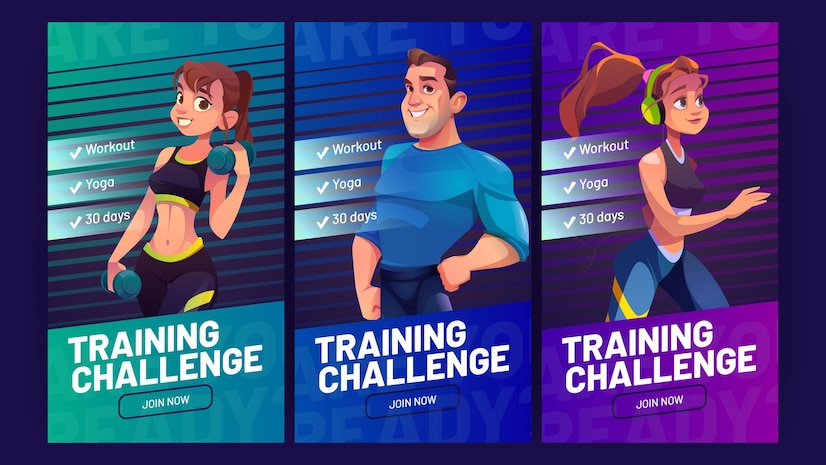
App for Personal Challenges:
A fascinating opportunity provided by the modern world is the ability to participate in a variety of challenges while being coached by coaches located all over the world. Here is some application design specifically focused on that concept. That is a collection of interactions for a mobile application design that enables users to participate in online challenges and improve their knowledge, skills, health, and fitness. The application design approach prioritized elegance, readability, and usability.

Quotes App:
This UI design concept combines knowledge and inspiration. Here are the interactions for a simple and sophisticated Quotes App, a mobile tool that enables users to compile wise words and images from many sources.
Task Management App:
View the user interface for a task tracker that enables users to schedule and keep track of various chores, events, and things to accomplish to boost productivity. The interface is beautiful and functional thanks to a tasteful and functional balance of dark and light backgrounds, lovely color accents, animated illustrations, onboarding, a variety of stats, clean transitions, and good readability.

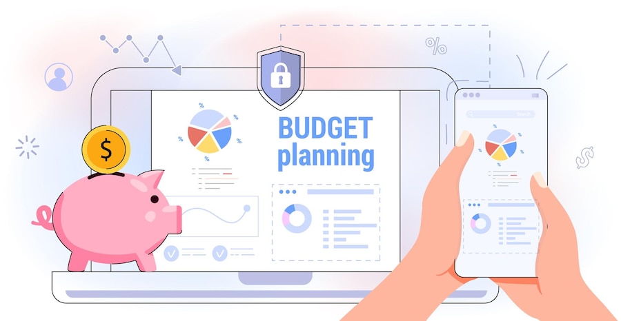
Finance Tracker App:
The theme of this design assignment is money and finance. Here is a financial tracker app that lets users track their earnings and outgoing costs. This mobile application's design features a dark theme, thoughtful and balanced use of unique, catchy images, good readability, and well-considered color accents for effective data display. Well-designed and captivating UI animation is another item to pay attention to.

Event App:
Being sociable is a test of your responsibility and being enjoyable and pleasant. It can be difficult to remember everything at times. Here is the app that resolves that issue. That is a straightforward mobile application for planning, recording, and monitoring events. Its primary target demographic is young people, which dictated the visual style's usage of bright, trendy colors and an eye-catching, bespoke illustration for the loading animation of transition.
App for Bees and Honey:
This app is all about the combination of sweetness and effort. Bees are the main focus. Here is the first glance at a few smartphone screens from the bee-themed app that allows users to purchase and hire bee families and acquire certain goods and helpful knowledge. Playfully designed onboarding screens that set a welcoming vibe and tone of voice from the first interaction with a user are another intriguing asymmetrical design element to catch users' attention.
Conclusion:
You would have a much better-looking UI right away if you considered the factors above. But other additional elements—such as typography, colors, iconography, and shadows—have a big impact on how professional your finished project seems. Only your taste, which you may build by looking at and recreating asymmetrical designs from your favorite app, can help you develop them.
FAQs:
Why is an excellent UI UX so special?
A good user interface should be invisible in addition to being "delightful"; a user should never be aware of the menu because they never had to consider where it was or how to utilize it. A solid UI adheres to brand guidelines, is consistent, simple to use, and keeps up with the most recent UX design trends.
How can I make my UX app better?
In this instance, two things can enhance the app's user experience:
- Reducing clutter and emphasizing essential items Is a little disorganized due to too many features.
- The user must take the absolute least action. Essentially, the navigation should be simple and familiar to the intended audience.
PriyaDharshini K.
Squash Apps engineering team